
Ars Thanea (winners of App Store Best of 2012 award) evaluate iOS 7 design and features
The new operating system is a completely „new” approach in terms of design, in the case of Apple products, we write „new” because, after all, the so-called. flat design has been present on third party platforms for years – see Windows metro/phone/8.
For Apple it is a novelty and basically a necessity to follow something that is currently widespread (popular in terms of quantity). It’s a bit of a shame, because it was Apple that was famous for innovative solutions, and others wanted to „copy them” this time the roles seem to have reversed.
I. Design
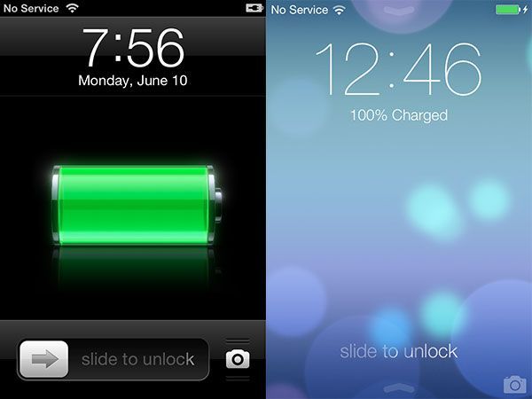
As for the design, early on, the start screen is devoid of the famous „unlock” bar;. Instead of a bar graphic, we have a misleading caption with an arrow underneath it, suggesting you unlock the screen „slide” up. Proper unlocking, which is a slide sideways anywhere on the screen, is an attempt to refer to android solutions.
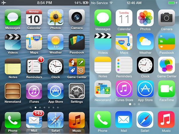
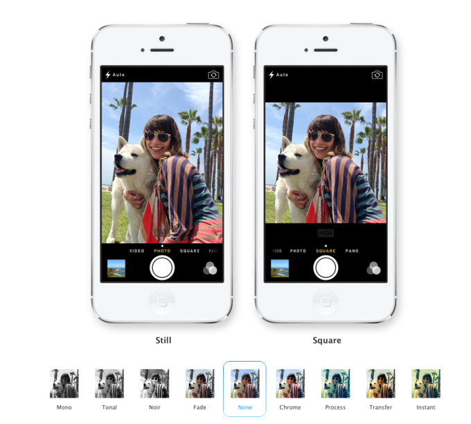
Minimal camera icon at the bottom of the screen, it is an inconvenient solution due to the size mismatched to the capabilities of the screen and the convenience of hitting the icon.
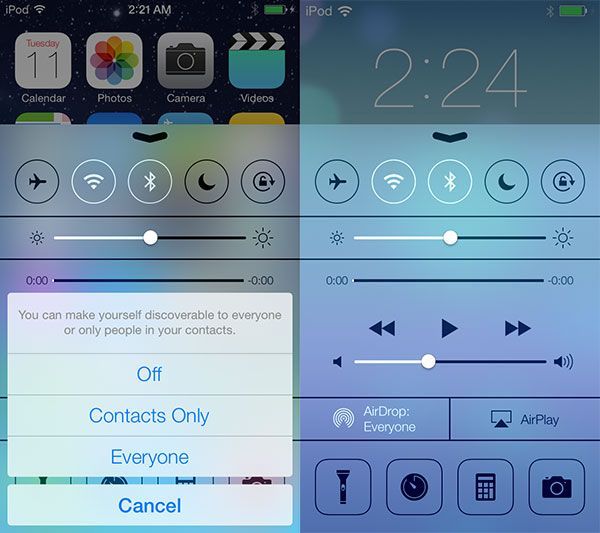
Further screen with quick access to options. Here we come across a surprise with „blur(em)”, completely unnecessary, redundant just like in Windows Vista. On the same screen we have completely new icons for these features, it looks like a wireframe/draft/functional design, not a target solution.
In the end it is not at all better – icons of major applications, also underwent „flattening”, also got a new landry colors, to this styling is inconsistent.
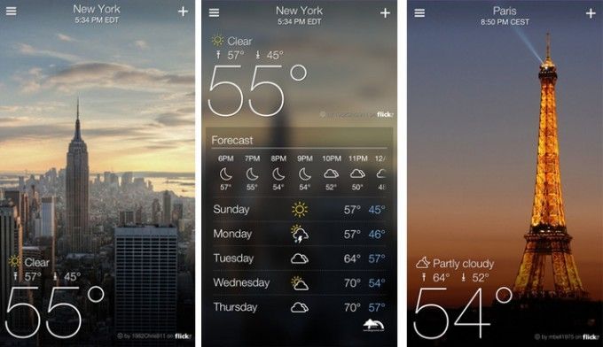
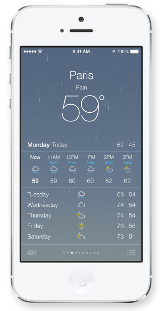
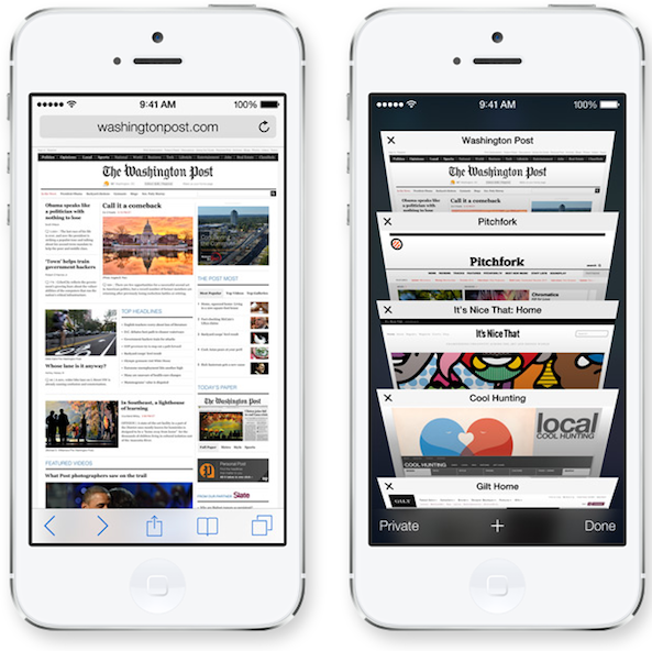
 It is not always clear what is a button, and what is just a headline. To this the constant borrowing, a little from Android, a little from Windows Phone. You can also see strong inspiration from apps and ideas from other independent developers, such as bookmarks in the new Safari, or the weather app. Animations, show and hide windows.
II Features
Leaving aside the design issues – because probably some people sooner or later will accept the new look – iOS 7 received a few improvements. Improved notification center – on the plus side: categorized items (widgets) that are there, but the blur under the app seems to be again unnecessary, it is possible that the icons will not be visible on a bright background.
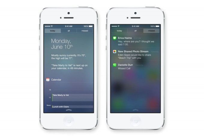
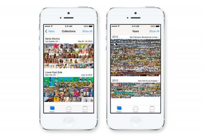
Photo gallery management options – on plus. e.g. sorting photos by date, or an improved version of the camera application with filters and cropping.
Brand new applications: iRadio (the equivalent of Spotify) with the possibility to buy a subscription, AirDrop for sharing e.g. photos, iCloud KeyChain (something like the 1password app), and some minor settings in Safari, but again, we feel like these things should have been on Apple devices long ago.
This is not a revolutionary system. Apple is not ahead of its competitors in any function, it just keeps up with them. iOS 7 to us looks like iOS 6.5.
New iOS doesn’t reassure current users that their devices are special. In our opinion, it is designed to attract users from brands other than Apple.
The group of recipients-religionists of the Apple brand has already stopped growing, which is currently visible by the results of Apple’s shares on the stock exchange.
 The authors of this entry are: Piotr Bajtała, head of mobile (top) and Tomasz Szymański, business development leader at Ars Thanea. Ars Thanea is one of the leading creative agencies on the Polish market, and their design is recognized beyond the borders of our country. Collaborated with the greatest masters of graphics and animation, including Disney’s. Their game “Puzzle Craft” was awarded in 2012 in the category “New Ways to Play” in the annual summary for the best games and applications from the App Store.